SuperStamps Infographics, Your Wisdom is Needed!
Infographics has been around for years, but has gained enormous interest online the last few years, as I am sure you have noticed.
Infographics help present complex information quickly and clearly. But it's not always as easy as to just put together an
infographic. To effectively communicate it needs to be professional and clear. There are artists focused on creating infographics for you, but if you don't have a few hundred dollars to spend you won't get far.This is where Callouts come into scene. We will create the professional graphic images you need in order to create your own stylish infographics.
Your Ideas are Needed
But to do this right we need your input. How do you want them to look, what are you going to use them for et cetera. We will develop this set of Infographics together with you, by posting questions on this blog and collecting comments from you.
We are counting on launching the SuperStamps Infographics pack in November or December this year. It will be available for Callouts Premium members as a Monthly Special and it will also be available for sale. But as we really appreciate your help with suggestions on how to develop this package we are going to randomly draw 10 people for each round of information gathering and give you a free copy of SuperStamps Infographics once released.
Inspiration
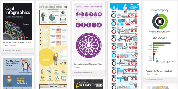
For your inspiration I have linked a large collection of amazing Infographics available on Pinterest (opens in a new window).
What do you want?
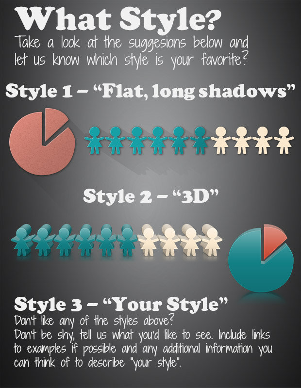
Please see the image below and help us decide what direction to take this. What kind of style of Infographics do you want to see? Use the review or facebook comment field below and let us know what you think. The ten randomly drawn winners will be published in the comment section below and on our Facebook page around October 8th. Please note that the suggestions below are mock-ups of the final release. We will put in a lot of work with shadows, surface et cetera for them to look really professional.
Your input is highly appreciated!

Share your ideas below. You can use either the Facebook commenting or the Callouts comment field.


Option 2 for 3D! The long shadows will take up too much space to be effective. IMHO.
My vote goes to style 1, style 2 is too busy.
Hi,
I like the 3D call outs best.
Regards,
chris
Learning and Development areas, Inspirational and Experiential.
Style 1, cleaner and clearer. I do see instances where style 2 can work, though. I love it when you ask for our opinion and give everyone a chance to participate. Thanks 🙂
Ditto on the 3D style!
I like the uncluttered look of #1.
Great idea!
I prefer the Style #2 – 3D. But, of course, it would be great to count with all of them.
By what I understood the Superstamps Infographics will contains the “basic”, or, the necessary files/images so we can create our own infographics. Is this correct?
Well, themes can be a lot of things. Technology, social, social informations, gaming, the most downloaded files, etc, etc.
Hi Marcos,
That’s a good question. I am not sure how many images will be included in the final package but it is my ambition that it will be quite extensive, covering the basis of any infographics. See the examples I linked above as an example. In many of them you can see a series of images that are useful for most infographics. We will try to include all of those. We will also try to add more graphics in various areas that are suggested during the development.
Style 1 is plain and simple so I go for it.
I like the 2nd option if I am going to add graphics I like the 3 D since this is not something I could easily create. I also like the idea of adding themed graphics so we can use in e-learning training to create a story.
Great! Thanks Peter!
Wow, that is very ambitious. I’d be all over a package like this that has a ton of graphics I can use to build infographics. I think this is going to be one of those things that will explode in popularity and demand. Right after you launch it, you’ll undoubtedly have many requesting specific graphics which will help you expand it month over month.
I like 3D style but more so minimalist style like:
http://www.pinterest.com/pin/207939707769213446/
Looking forward to your infographics
Jeff
Thanks Jeff,
Great suggestion! The future of SuperStamps Infographics is unsure at this time. Unfortunately we didn’t get a lot of interest, comments here about the product which leads me to believe it wasn’t very interesting. I haven’t decided 100% yet.